xx.08.2019 (Week 5 - Week 8)
Rausha Aminath (0337000)
Publishing Design
Project 2
LECTURES
Lecture 5:
This weeks lecture was on typography in book designs and below is the ppt of the lecture.
INSTRUCTIONS
WORK
Week 5
This week we started looking for references for our book layout and started working on our half title, full title, contents, introduction and also chapter 1. Below are my references.
First draft attempt.
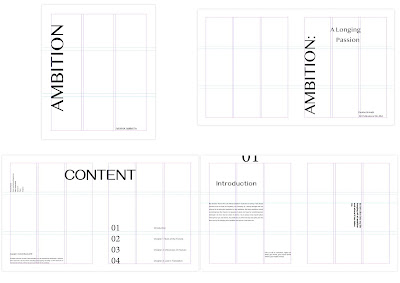 |
| Fig 1.0 Layout Configuration Attempt 1 |
Week 6
This week we got feedback for our layout design till the end of chapter 1and started fixing the layout and decided on the final layout design.
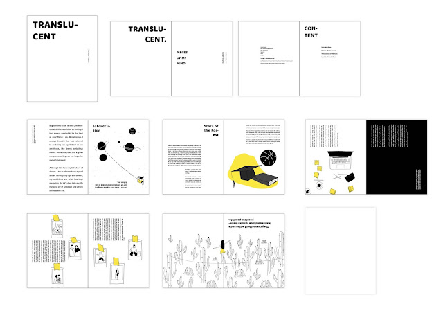 |
| Fig 1.01 Chapter 1 Layout Attempt 2 |
After consulting with Mr.Vinod I changed the font of my title to match the change of font he asked me to make for the chapter title matching the subtext as well. I also introduced a new title style to be used throughout the title of chapters as well.
Week 7
FEEDBACKS
Week 5:
After checking my 16 visuals, Mr.Vinod said he liked the contrasting yellow against the black. However, I still need to increase content and details and make it less empty. The layout needs more work for the placement of the title. Introduction can be made different from other pages. Make it stand out
Week 6: Good Visual References. Make pull quote stand out from subtext.
Mr.Vinod said my title placing needs more work, and to change the subheading font and make the subtext and pull quotes different. Make the pull quote stand out more. After fixing, Mr.Vinod said the layout looks good and to go ahead with the other chapters
Week 7: Layout is good. Mr.Vinod was okay with my layout, however he asked me to be careful with rivers and to fix it as much as I can, although it cannot be fixed completely. He asked to introduce another colour to complement yellow and introduce it in the chapter titles and add small of it in the illustration if necessary. He also showed me which pages to introduce full page of yellow and double spread yellow pages
Week 8:
After looking at my cover attempts Mr.Vinod gave online feedback: It’s too plain. No visual impact. Think. Your books going to be in shelve with other books. Will this jump out?
REFLECTIONS
EXPERIENCE
Week 5: I am kinda okay with the visuals for now. Just want to submit. However I really wish I had thought more about the style and how it would work and planned out my book before I started with visuals. Over all I feel very messy this semester. Everything seems all over the place and I am having a tough time grasping on and catching up. I still cant seem to get a hold of everything.
Week 6: Creating layout is something I enjoy and seeing everything come together from project 1 is actually very calming and therapeutic for me. The work did not seem like work for me and I am enjoying it alot.
Week 7: Kerning is making the book layouts a bit difficult to finish up. It's a tough this to nail. Some parts of the book I really am unable to fix.
Week 8: Submitting the final book was nice. To see it all printed up it was nice but I started seeing that I was right, the book I designed was not my best work. Specially the cover was really unattractive for me.
OBSERVATIONS
Week 5: Finishing my visuals, I can see that although I tried different variations, my work ended up with the direction i set my mind to from the beginning of using just one colour, however I did not expect to use yellow, my idea was using red however I thought its good to keep yellow since its a good contrast to black and is not as overwhelming as red.
Week 6: Layout is something usually everyone choses to go very normal and not many has explored outside the box, but I wanted to create something different, I dont want a traditional grid system and I liked working on it.
Week 7: The visuals were difficult to match to the pages, we have to make sure our visuals are arranged well with the content. Full spread visuals are important to create some dynamic differences in the spreads and it makes the book more interesting.
Week 8: Everyone was having a tough time making the cover and I noticed that it was not just me who was unable to come up with ideas and also. Everyone was slowly losing their cool and at the end of the class most people finished their covers however I was working so slow.
FINDINGS
Week 5: This semester felt okay at the beginning and at one point everything became too much and now I find myself very exhausted all the time and this is being shown in my work also. I'm scared for my final outcomes.
Week 6: Even with making layouts with thinking outside the box, it is important to follow rules of form and function. Experiment layouts should also use the grid system as a guide.
Week 7: I found out that I cant keep myself locked into one type of typeface or one type of art style. I need to start exploring more and get out of my comfort zone more.
Week 8: Making a cover takes a lot of thinking and alot of design elements goes into it. We have to consider all aspects and making a cover is not simple as the illustrations inside a book
FURTHER READINGS
Week 7
Design and Layout: Understanding and Using Graphics by David Dabner
Balance and Harmony: Combining and positioning multiple elements
This chapter talks about the rules and guidelines to follow when creating a layout with multiple elements such as images and texts.
- Engaging multiple elements: Decide on the relative importance of the elements the amount of emphasis to be placed on the image and the text. and go through the same procedure for subheadings and the text.
- Symmetrical arrangement: text and image have equal engagement. Heading placed on top in the middle and thus creates quiet harmony
- Asymmetrical arrangement: Less text or smaller image size creating emphasis on either one and not both elements.
- Heading Dominating
- Picture Dominating
Balance and Harmony: The use of the grid
The number of units within the grid system depends on the content. The more involved the content, the more versatile the content should be. A complex grid system would have different sizes of the grids and accomodate content based on the emphasis given to the content.
Week 8
Typeface: Display Typefaces
This chapter talks about the rules of choosing a display typefaces in a book.
Display type starts at 14pt; usually serves as a heading or a brief introduction to the main copy. When choosing the typeface think about the mood and feel of the content. Some typefaces are refined and gentle looking, while others are aggressive and strong. Decide if you want the display font to work with the content and work in harmony. For example, a serif type type for the contrasting with slab or sans serif type for the display.
Week 9
Text and Image: Combining
- Mood and Position: Always choose a typeface that matches the mood and type of the image
Text and Images: Combining
This chapter talks about the rules and guidelines to follow when mixing text and images in a layout.
- Mood and Position: Always choose a typeface that matches the mood and type of the image




Comments
Post a Comment