PUBLISHING DESIGN - FINAL PROJECT
Rausha Aminath (0337000)
Publishing Design
Final Project
INSTRUCTIONS
WORK
Week 8
Layout
This week we started working on our final project, which is creating an E book version of our book done for project 2. For this week, Mr.vinod has asked to finish our first draft of layout till the end of chapter 1. Below are my first attempts at E book layout and the process.
Week 9
Layout
Layout
This week we started working on our final project, which is creating an E book version of our book done for project 2. For this week, Mr.Vinod has asked to finish our first draft of layout till the end of chapter 1. Below are my first attempts at E book layout and the process.
Below are my first attempts at animation.
 |
| Layout Process |
 |
| Adding Interactive Animations - Pull quotes |
This week after seeing our animations, Mr.Vinod was a bit worried about the animations and thus suggested creating the whole book in the E Book form. Previously it was just till the end of chapter one, however he said we had the option of making the whole book, or make till the end of chapter 1. If we chose to to only till the end of chapter 1, our animations must be really good. However, I was not that confident about my animations therefore I decided to not take a chance and do the whole book.
Week 10
Layout and Animation
Layout and Animation
This week we worked mostly on making our layouts better and making sure our interactiveness of the E book was good, in the meantime we also showed our animation updates and made necessary changes.
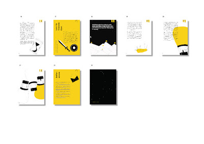
This week I also finalised my layout. Below is the final layout.
 |
| Attempt 2 - Full Book Layout |
 |
| Attempt 2 - Full Book Layout |
Attempt 2
Week 11
Interactive Buttons
Interactive Buttons
After I showed my progress, Mr.Vinod Suggested a smaller size of the navigation button and therefore, I introduced another, simple button idea. The idea was to to keep it related to the book yet not too distracting from the content itself.
 |
| Adding Buttons and Rollover |
 |
| Adding Buttons and Rollover |
Week 12
Final Animations.
Final Animations.
 |
| Final Animations - To do |
 |
| Final Animation - My Goals |
 |
| Final Animations - Bold Moves |
 |
| Final Animation - Study Table |
 |
| Final Animation - Family and Friends |
 |
| Final Animations - Bold Moves |
 |
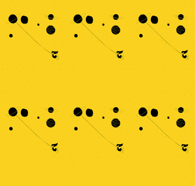
| Final Animations - Space |
 |
| Final Animations - Climbing Mountains |
 |
| Final Animation - Floating Dreamer 1 |
 |
| Final Animation - Floating Dreamer |
 |
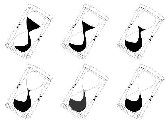
| Final Animation - Hour Glass |
 |
| Final Animation - Standing Out |
 |
| Final Animation - Growth |
 |
| Final Animation - Opening Mails |
 |
| Cover Animation |
Week 13
This week we made final changes and finished E book and published online. Below are my final submissions.
FINAL PROJECT OUTCOME
This week we made final changes and finished E book and published online. Below are my final submissions.
FINAL PROJECT OUTCOME
FEEDBACKS
Week 8: After looking at my cover attempts Mr.Vinod gave online feedback: It’s too plain. No visual impact. Think. Your books going to be in shelve with other books. Will this jump out?
Week 9: After seeing my iPad layout, Mr.Vinod suggested increasing the size of the text, layout looks okay. He also approved my cover and asked to proceed with animations
Week 10: After seeing my printed outcome for project 2, Mr.Vinod said it looks okay. He asked me to work more on the animations
Week 11: Mr.Vinod Suggested changing the strokes of my visuals before completing the animations and also gave some more feedback on the printed book. He told to Fix as much as I can and then print again.
Week 13: No looping for few animations. Get rid of half title page and consider the colour change in next.
REFLECTIONS
EXPERIENCE
Week 8: The class was kinda calm but I was having a hard time doing the cover. I was unable to come up with any ideas to make the cover more interesting or stand out.
Week 9: Creating an iPad layout is difficult as I can hardly remember the layout and how it works. It was difficult to decide on the buttons and also the interactiveness.
Week 10: The class was very boring today. I was getting frustrated with the animations and the fact that it was taking so much time. So I just spent most of my time staring at the laptop to see the changes.
Week 11: I felt like redoing all my work. Honest looking at my final outcomes of the book, I was having a small breakdown, knowing that it does not reflect my best work.
Week 12: Animations was difficult to get done because I was having a tough time with my Mac and it was making the quality of my work low and limiting the amount of work I can do and its very frustrating. Honestly this semester is starting to become the worst so far. I really cant get anything done to any of my expectation levels.
Week 13: The class was quite hectic today, although I had finished most of my book, I just have difficulty in technical things such as creating gifs and seeing preview of my work. It is hard to work and create good animations and also make the work perfect with the preview being invisible.
OBSERVATIONS
Week 8: Everyone was having a tough time making the cover and I noticed that it was not just me who was unable to come up with ideas and also. Everyone was slowly losing their cool and at the end of the class most people finished their covers however I was working so slow.
Week 9: iPad version is difficult to adjust with the visuals, I have to spilt some visuals and I was not sure of which directions I was aiming for.
Week 10: Animations itself was taking small time if I knew what I was doing before starting. If I didnt have a clear plan it makes my work extra slow.
Week 11: The ebook looks very similar to my printed book and also the small grids are maybe not that appropriate for the iPad so maybe I will change the layout a bit.
Week 12: I feel like my work speed is extra extra slow this semester and I still cant catch up and follow my schedule. I cant finish any works on the time frame I set myself to. I feel very out of balance and its effecting my work alot
Week 13: The final outcome looks okay. It could be so much better but I have no time to redo what I want to.
FINDINGS
Week 8: Making a cover takes a lot of thinking and alot of design elements goes into it. We have to consider all aspects and making a cover is not simple as the illustrations inside a book
Week 9: The file versions of the animations has to be the same size of the ipad version inorder to make sure the animation fits well into the book.
Week 10: Creating the animations is tough again, fixing a small part could make me restart the whole animation and its taking alot of time and I was getting behind with all my work in the module.
Week 11: Creating an E book, the animations of the text is not that nice if its too much, Need to keep it very minimal and have to consider navigation options for that as well.
Week 12: Creating the E Book interactivity is a bit complicated. Interactiveness should not affect the readability but we have to make sure the interactiveness is there to some extent and it should engage the readers and make them want to keep reading. The interactiveness is not easy to get done.
Week 13: The final outcome of the animations looks good. But the quality is so bad and that makes the ebook export look bad as well for some animations.
FURTHER READINGS
 |
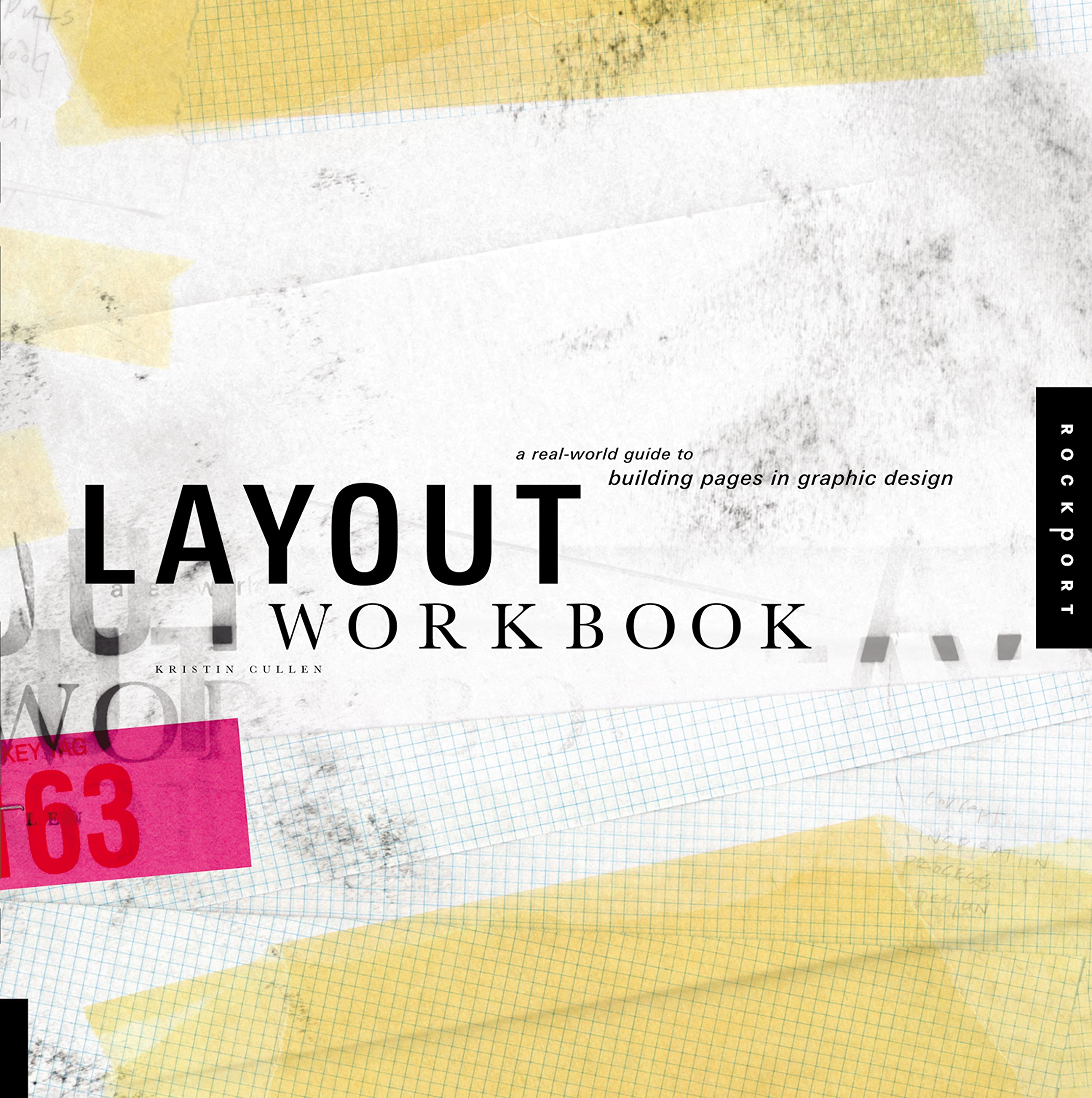
| Book Cover |
Week 8 - 9
The Function of Design
The Function of Design is not Decorative. Though Sophisticated aesthetics and excellent visual execution are essential to the design, communicative function is absolutely imperative - it is the primary purpose. Design educates, inspires and entertains, as well as informs and encourages. Design also create awareness and nurtures dialogue, while directing, guiding, motivating, promoting, and persuading. It Conveys and ignites attitudes and emotions. Design is remarkably functional.
The Function of Design is not Decorative. Though Sophisticated aesthetics and excellent visual execution are essential to the design, communicative function is absolutely imperative - it is the primary purpose. Design educates, inspires and entertains, as well as informs and encourages. Design also create awareness and nurtures dialogue, while directing, guiding, motivating, promoting, and persuading. It Conveys and ignites attitudes and emotions. Design is remarkably functional.
Week 10 - 11
Breaking the Grid:
No grids (or rues) are absolute. There are numerous paths that lead to appropriate, dynamic, and effective visual solutions. Grids provide the basic, as well as innumerable options, to construct strong layouts. Experience, practice and experimentation lead to productive results. The designer must control the composition using the grids as a guide rather than a dictator pf the layout. As such the designer must break the grid in small or large increments for the benefit of the design. However, if the grid is broken too often, it may indicate that it is not suitably developed for the content.
No grids (or rues) are absolute. There are numerous paths that lead to appropriate, dynamic, and effective visual solutions. Grids provide the basic, as well as innumerable options, to construct strong layouts. Experience, practice and experimentation lead to productive results. The designer must control the composition using the grids as a guide rather than a dictator pf the layout. As such the designer must break the grid in small or large increments for the benefit of the design. However, if the grid is broken too often, it may indicate that it is not suitably developed for the content.


Comments
Post a Comment