02.04.2019 (Week 1 - Week 4)
Rausha Aminath (0337000)
Typography
Exercises
LECTURES
Lecture 1: Introduction to Module
02.04.2019 (Week 1)
The class started with an introduction to the module and week by week what we would be working on. We were shown examples of project 1 and the executions. We were shown good and acceptable works and Mr.Vinod explained why things were good and why they were not. We were told that this module will involve alot of conceptual work and deeper connection to typography.
For our first exercise we are studying the different types of Typographic Systems. We were then instructed to start working on ideas for which we will work in class next week. Mr.Vinod asked to prepare 2 designs for each Typographic System.
Lecture 2: Typographic Systems
09.04.2019 (Week 2)
Class started with presentations by each groups on their assigned Typographic System.
Here is the combined presentation.
Lecture 3: Finding Type
16.04.2019 (Week 3)
There was no lecture, we worked on our typographic systems. Afterwards, we were briefed on what to do for Type & Play before we come to next weeks class.
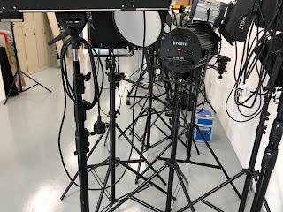
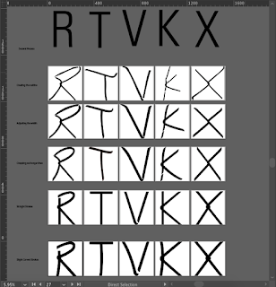
We were instructed to take a photo of man-made objects, structures, or nature and dissect 4 to 5 letters forms within the image.
Lecture 4: Finding Type
23.04.2019 (Week 4)
Lecture 5: Type and Pay
30.04.2019 (Week 5)
No lecture this week. We continued our work in Type and play.
INSTRUCTIONS
WORK
Typographic Systems | Week 1
I started sketching my ideas after reading the book, Typographic Systems by Kimberly Elam. I gathered ideas and samples for my sketches from the book as well as from online available samples.
 |
| Fig 1.0 Sketches 1 |
 |
| Fig 1.1 Sketches 2 |
 |
| Photos Used |
 |
| Attempt 2 |
 |
| Attempt 3 |
 |
| Photos Used |
 |
| Attempt 4 |
 |
| Attempt 5 |
 |
| Attempts 2,4,5 on the first photo |
 |
| Attempt 3 |
After I showed the attempts Mr.Shamusul said attempt 3 has better interplay and therefor work more on it and fix the alignment and the size of "OF".
 |
| Final Outcome for Type & Play |
Final Outcome for Type & Play - Embedded Pdf
FEEDBACKS
Week 2:
General feedback: Mr.Vinod liked our presentation said that it was very well explained and examples were excellent. And gave pointers on how to improve our presentation and asked us to improve our PPT files.
Specific Feedback: Mr.Vinod liked my Radial design on Indesign, found one design interesting and asked me to pin point two points more clearly in the other. Mr.Shamsul said that in my first design on Axial had too much white space and Mr.Vinod pointed out rivers and to get rid of them. While he approved most of my designs, he recommended working a bit more on grid system and Bilateral one design. He suggested working only with text first and then add lines and colors later
Week 3:
After checking my second draft, Mr.Vinod suggested being careful with leading and kerning. He said that the designs will become so much better afterwards. He wanted me to work on my transitional, grid and Modular designs a bit more. He said to avoid using the small non objective elements I already had in my designs. Mr.Shamsul also pointed out leading. He said the designs will be clean and neat to look at. Mr.Vinod approved some of my designs.
Week 4:
After checking my e-portfolio Mr.Vinod and Mr.Shamsul said I need to post the sketches of the systems and also update the next exercise. Overall everything else was fine.
For my systems Mr.Shamsul and Mr.Vinod liked my work and said that it was excellent work. However, one of the random could be a bit more random. And also just to lighten my background for one of the text box in the Radial system.
After looking at my systems Mr.Vinod stated that I am very structured and that is why having difficulty making random more random.
Looking at my finding letter, Mr.Vinod said to choose one and start refining process. He suggested trying to dissect as many letters I can and finding the perfect letter for refining.
Week 5:
Mr.Vinod looked at the dissected letters, he said I'm almost there and to just make the lines straight and just maintaining one feature from the wires would be enough and that was the knot, he suggested keeping the knot in the letter X and keep the gaps in the letter stokes same width as the letter stroke width. Later after he looked at my changed letters, he realized that the lines being too straight did not look good so he suggested making it a bit curvy and to make sure all the strokes are of same size.
For my type and play exercise, my first try photo was a bit too simple and not interesting so Mr.Shamsul suggested changing it. After he saw my next try, he said its better and the photo I chose was nice and to place more focus on the two words "Leap" and "Faith"
Feedback online Mr.Vinod: It does conform to the requirement, however it’s not very surprising in its use or exciting. The interplay I mean. So it depends on how far you want to push yourself Rausha. As it stands I would think this is approximately a C+ lowest, B- highest. Don’t do it for the A, do it because you would like to know how creative or skillful your solution could be.Good luck. You have time. You can work with the b/ground. It’s how you relate the type with the image in a experimental and surprising way. You can tone down the b/ground if you feel it would work better. But essentially you need to go beyond just placing type in a space and be a little more expressive (and experimental perhaps).
Week 6:
Online feedback: Finding Type Mr.Vinod: Looks much better. Increase the thickness of the stroke and see. Later: Improving.
Online feedback: Type & Play Mr.Shamsul: You can still work on this. Make the alignment better. Maybe the word of shouldn't be as big as faith. I like this the most as it have the interplay between the text and image. Alright. Good work
Looking at my final outcome for finding type, Mr.Vinod said that it was a very good work and he would like me to develop this typeface as he has never seen a typeface with this type of features and he liked the characteristics of the type, the gaps and the knot.
For my type & play MR.Vinod and Mr.Shamsul said that it is good and I have managed to make the words interplay well. He asked to change the size of the word 'Faith". Apart from that the work was approved and good to go.
REFLECTIONS
EXPERIENCE
Week 1:
I felt that the class was kinda calm and everyone was interested in what were expected of us. I was also very inspired by how Mr.Vinod talked about his experience and how our work falls under originality and how it should stand out. I was interested in the part where he talked about how our work should show some part of us in it, which makes it stand out.
Week 2:
I was a bit relaxed as I got most of the work done and only needed feedback for all the designs, however I was nervous about all my designs. I knew my designs were not final and were just the first attempt, I was eager to get feedback and improve it and finish off the first exercise before next week class started.
Week 3:
I was worried about my designs as I knew it was not my best work so I was nervous to get feedback as well. Through out the class I was very anxious and I felt like I did not have much new ideas and was worried about my final outcome and if I will be able to finish it on time.
Week 4:
This exercise seemed interesting and I was excited to use image. However, as I went further looking into finding the image, I realized that this was not going to be easy. The type interplay has to be planned out well. Just using a good photo did not do me much good because I was having a hard time trying to find a good interplay.
OBSERVATIONS
Week 1:
I observed that it takes a lot of passion to actually succeed in this field or any for that matter. I saw that it takes a lot of work and planning and to always be prepared.
Week 2:
The class was kinda interactive as we had our presentations. I noticed that Mr. Vinod and Mr.Shamsul were trying new ways to make the class more interactive make all students participate and it was working.
Week 3:
Everyone was kinda quiet in the class, trying to finish their typographic grids and I saw that most of my classmates were doing a good job and everyone was improving their designs and learning new things but everyone was kinda forgetting of the basic rules in typography we learned from the first semester.
Week 4:
I observed that the search for the photo was taking up alot of my time and since we were supposed to finish the work by today, I was getting pretty nervous as I was not working according to my planned out timings. After I chose the photo even, the interplay was not that good so I was nervous about this exercise, whether I can finish it well.
FINDINGS
Week 1:
I found myself inspired and I realized that I actually have a greater passion towards Typography rather than illustrations and Animations. I want to focus more on Typography and start thinking about future and what I wanted to do with Typography in relation to Maldivian Culture. I want to stand out in my Community. I realized that I should take inspiration from my culture rather than trying to create similar things as to what I see from my classmates or from the internet. I got inspired to take some risks this time with my work.
Week 2:
I was worried about my designs, was not sure if it was my best work. However, after getting feedback, I realized how I can do better. I realized that the more time I spend on it the better the outcome is.
Week 3:
I realized that most of my works were pretty similar and it was pretty difficult to come up new designs. I realized that I have to research and read in order to really understand the systems. There are so many rules within these systems that we need to understand before we start designing.
Week 4:
I realized that in the end, after completing this exercise I will be kinda happy as this was going to be the last exercise and this was kinda motivating me to finish soon. This work in essentially taking more time than I thought it would and I knew that I was going to be dreading over this all throughout the weekend.
FURTHER READINGS
Typographic Design: Form and Communication (6th Edition)
Week 1
 |
| Book Cover |
Chapter 1 : The Typographic Grid
This chapter talks about the importance of Typographic Grid. A grid is a skeletal framework used by designers to organize information within a spatial field. It is a system characterized by the dualities of freedom and composing text and other visual information. Grid systems aid designers in making information clear and optimally accessible. When used effectively, typographic grids provide form and space with proportional harmony and aesthetic beauty.
There are different types of grids, including square grids, single column grids, multicolumn grids, and
Modular grids.
When working with multicolumn grids, it is essential to balance three interdependent variable. These are type size, line length, and interline spacing.
When is the use of modular grid systems desirable than regular grid systems? The modular grid system offers opportunities to present more complex information with high degree of clarity. Modules are formed by intersections of horizontal and vertical lines. These zones provide zones for the placement of different information in a hierarchy. The more complex the grid structure, the more flexible the organizational possibilities. Organizing material within a grid structure is balancing between variety and unity, too much variety can deprive of it from hierarchy and too much of unity can become monotonous for the reader.
Typographic Systems by Kimberly Elam
Week 2 - 3
All designs are based on a structural system and these can be divided into main 8 major variations. Typographic organization is complex as the elements are independent on communication. In order to function, additional criteria such as hierarchy, order of reading, legibility and contrast come to play. The typographic systems are a kin to what architects term shape grammars.
Radial System: All elements extend from a point of focus.
Dilatational System: All elements expand from a central point in a circular fashion.
Random System: Elements appear to have no specific pattern or relation.
Grid System: A system of vertical and horizontal divisions.
Transitional System: An informal System of layered banding.
Modular System: A series of non-objective elements that are constructed as standardized units.
Bilateral Systems: All texts are arranged symmetrically on a single axis.
Using non-objective elements sharpens and articulates the composition. These elements strengthens ta message by communicating a sense of organization and direction.


Comments
Post a Comment