ADVANCED TYPOGRAPHY - PROJECT 2

23.05.2019 (Week 8 - Week 9)
Rausha Aminath (0337000)
Advanced Typography
Project 2
LECTURES
Lecture 8:
21.05.2019 (Week 8)
No Lecture this week. We moved on to working on our collaterals.
Lecture 9:
28.05.2019 (Week 9)
No Lecture this week. We continued working on our collaterals.
INSTRUCTIONS
WORK
Week 8
After getting the approval from the lecturers for the artwork, we moved on to creating collaterals for our designs, which was the second project of the module. For the conference we had to make promotional materials. By using the key artwork we were tasked to create different collaterals such as poster (static and Animated), invite (interactive), Tshirt, sticker, Pin badge, etc.
1. POSTER
 |
| Fig 1.0 Poster Work Process |
 |
| Fig 1.1 Process |
 |
| Fig 1.2 Attempt #2 |
 |
| Fig 1.3 Final Outcome |
Week 9
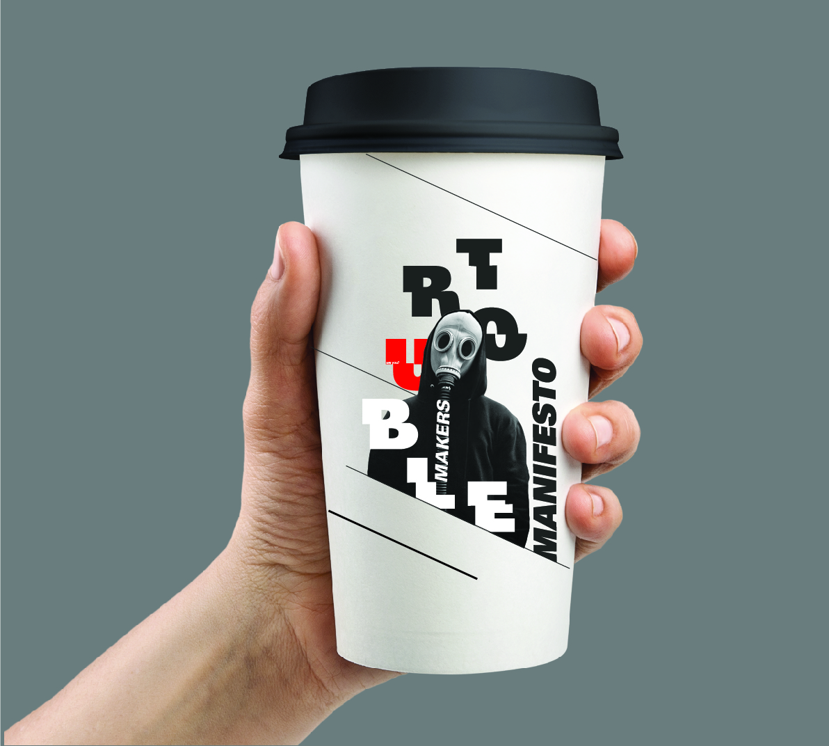
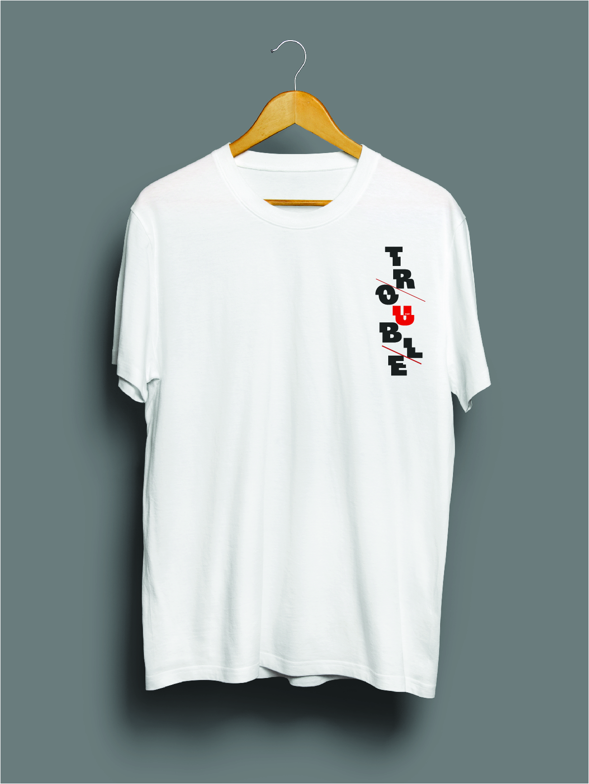
This week I moved on to creating other collaterals. At first I wanted to create something that most of my classmates were not doing so I chose a mug and also a cup also however, after getting feedback I decided to choose tote bag and t shirt. Mr.Vinod asked me to make the tote bag a bit more exciting since my poster looks exciting and to keep the bag simple does not make sense much.
 |
| Fig 2.0 Attempt #1 at Cup |
 |
| Fig 2.1 Attempt #2 at Cup |
 |
| Fig 2.2 Attempt #1 at Mug |
2. T SHIRT
 |
| Fig 3.1 Attempt #1 Front |
 |
| Fig 3.2 Attempt #1 Back |
 |
| Fig 3.3 Attempt #2 Front |
 |
| Fig 3.4 Attempt #2 Back |
 |
| Fig 3.5 Attempt #3 |
 |
| Fig 3.6 Attempt #4 |
 |
| Fig 3.7 Collateral #2 Tshirt |
 |
| Fig 4.0 Attempt #1 Tote bag |
 |
| Fig 4.1 Attempt #2 Tote bag |
 |
| Fig 4.2 Attempt #2 Tote bag |
 |
| Fig 4.4 Final Tote bag Process |
 |
| Fig 4.5 Collateral #3 Tote bag Front Final |
 |
| Fig 4.5 Collateral #2 Tote bag Back Final |
Week 10
This week I worked on the final collateral, which is a microsite to promote the event. This work is done under Interactive Design Project 2.
4. MICROSITE
 |
| Fig 5.0 Safari Preview #1 |
 |
| 5.1 Safarai Preview #2 |
 |
| Fig 5.2 Preview #3 |
 |
| Fig 5.3 Preview #4 |
FINAL MICROSITE
Here is the link to the microsite: https://sharp-euclid-a99f53.netlify.com/
ALL COLLATERALS FINAL OUTCOME
 |
| Fig 6.0 Collateral #1 Poster Final |
|
| Fig 6.1 Collateral #2 Tshirt |
|
| Fig 6.2 Collateral #3 Tote bag Front Final |
|
| Fig 6.3 Collateral #2 Tote bag Back Final |
 |
| Fig 6.4 Collateral #3 Microsite Final |
EMBEDDED PDF
PRINTED WORK
 |
| Poster |
 |
| Bag |
 |
| Tshirt |
 |
| Collaterals - Poster (Left) Totebag (Middle Top) Tshirt (Middle Down) Microsite (Right) |
Collaterals - Poster (Left) Totebag (Middle Top) Tshirt (Middle Down) Microsite (Right) - Embedded Pdf
FEEDBACKS
Week 8:
Specific feedback: Almost there but not done yet. Key artwork could sue a bit of an element from design. Poster layout seems fine, play around to get the best one.
Week 9:
Specific feedback: The Cup looks good however since it is a once used throwaway thing, Mr.Vinod suggested finding a mug that had the similar look and use that design on the cup. The tote bags needs some work. The t shirt looks good, add a design colloquium and maybe the date and its good to go.
REFLECTIONS
EXPERIENCE
Week 8:
After studying the 7 layout systems its has gotten easier to arrange information which makes the poster work less difficult than it was in semester 1. using the systems makes the posters look more well organized and has a good flow and hierarchy.
Week 9:
Making collaterals made me think of actually having my own brand and logo and this was kind of fun. Using my artwork in different collaterals made it seem like I had a brand that is being showcased in different collaterals and it made me think like a business owner sort of.
OBSERVATIONS
Week 8:
The artwork we choose is very important and requires a lot of thinking and we have to be very sure of it and have to experiment and make sure it works with different collaterals.
Week 9:
Making collaterals required a lot of thinking, to make each collateral different yet similar. The artwork we chose plays a huge role in making the products look good and I now can see the importance of that step and how we have to consider all these things before choosing an artwork.
FINDINGS
Week 8:
I found myself rethinking of my artwork and felt like using a photograph limits the creative ways I could use the artwork. I wanted to change my artwork to a created art piece on my own instead of a photograph.
Week 9:
I am not fully satisfied with my work, however there was not enough time to change everything. I know that I just have to make work with what I have right now.
FURTHER READINGS
Week 8
 |
| Book Cover |
Chapter: Letter
In this chapter the author talks about the importance of letters and history of its origin is important to designers. Typefaces are essential resources employed by graphic designers, just as glass, stone, steel, and other materials are employed by architects. Sometimes graphic designers create their own typeface and custom lettering. More commonly though, they tap the vast library of existing typefaces, choosing, combining them in response to a particular audience or situation. To do this they require knowledge of how and why letterforms have evolved.
Words have originated as gestures of the body. The first typefaces were directly modeled on the forms of calligraphy. Movable type had been employed earlier in China but have proven less useful there.
Words have originated as gestures of the body. The first typefaces were directly modeled on the forms of calligraphy. Movable type had been employed earlier in China but have proven less useful there.

Week 9
Chapter: Type as Program
This chapter talks about how the increase in electronics led to the introduction of letterforms on these devices. The dutch designer Wim Crouwel published designs for a "new alphabet" construction from straight lines.
 |
| Wim Crouwel straight line Type face |


Comments
Post a Comment